Have you ever wondered what exactly human use of the Internet looks like? With its Map of the Internet app, Cogeco Peer 1 can provide users with a tangible, 3D visualization of the world’s networks and how they connect to one another.
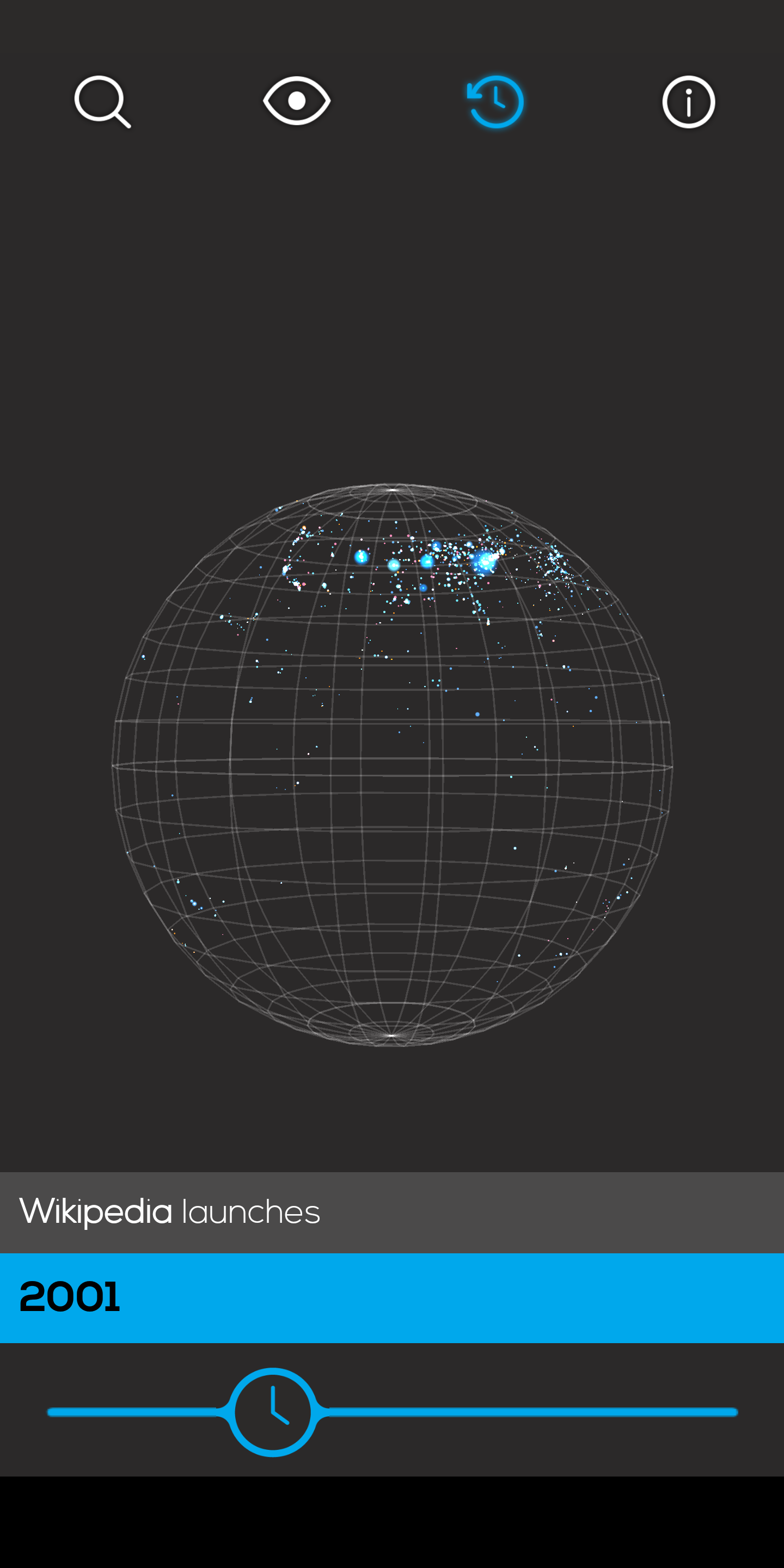
The Toronto-based company announced today the updated version of Map of the Internet that includes internet data up to 2017, as well as predictions as to what the internet will look like in the future, and an option to go back and see what it looked like during milestone moments such as the launch of Wikipedia.

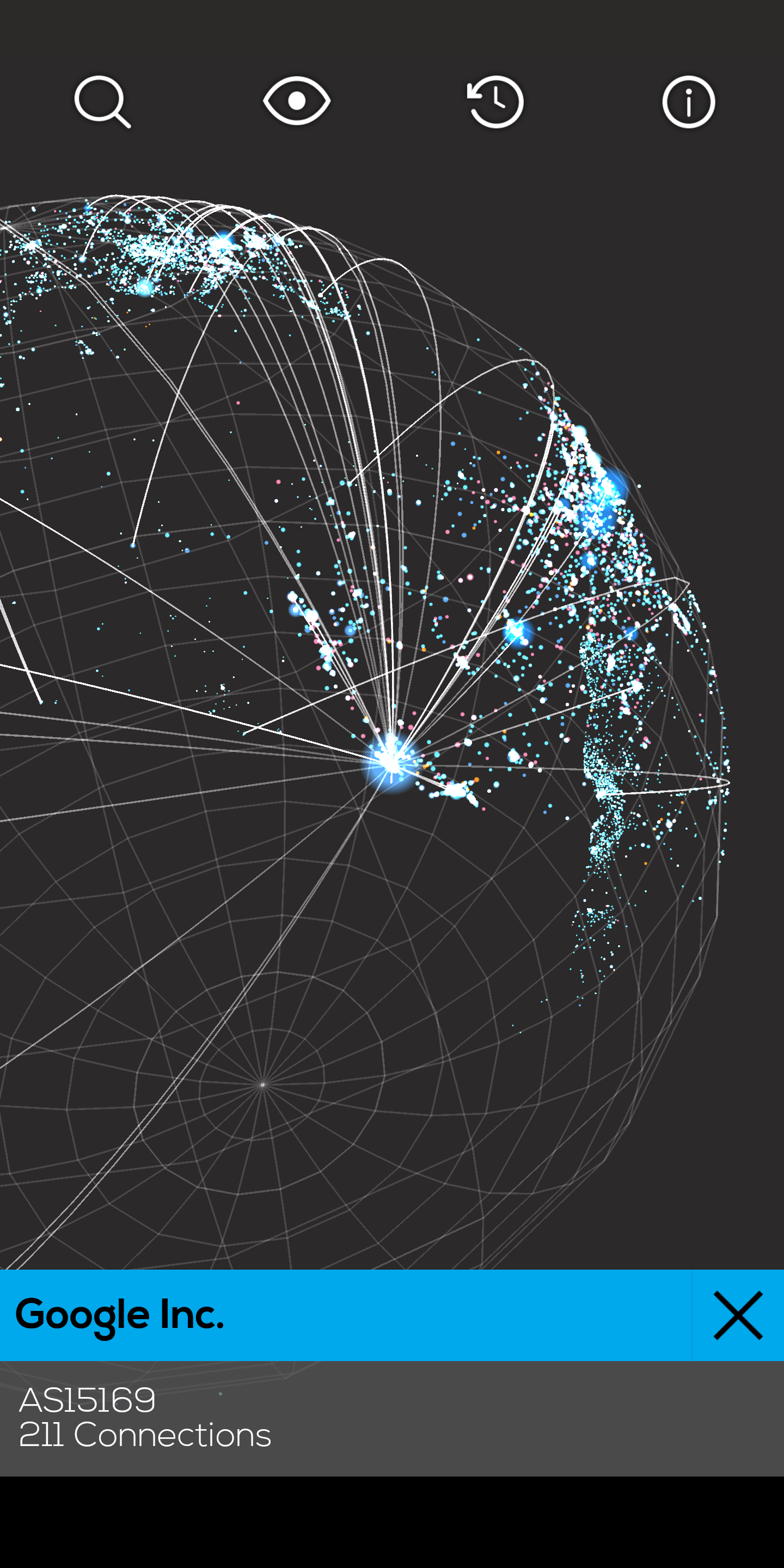
The app is designed as a free educational tool for iOS and Android. Users can explore where tech giants like Google and Facebook are located, as well as where internet service providers (ISPs), Internet exchange points, universities, and other organizations that route traffic online are.
“Map of the Internet will help people all over the world build awareness and further their knowledge of the structure of the internet and how it works,” said Craig Tavares, director of product innovation and technology at Cogeco Peer 1 in a release.

With Map of the Internet, users can also perform a traceroute to a node from your network, search for companies or domains, tap on nodes to learn more about them, and switch between geographic or hierarchical maps.
“Users can travel in time and journey back and forth through the internet’s highlights. Developers and students everywhere are encouraged to continue leveraging the open source platform and using its data to explore every node that connects websites around the world.”
Map of the Internet is available now on iOS and Android for free.
